Council Bluffs Schools Foundation
Bringing clarity and unity to an established organization

Sometimes giving has a snowball effect. This is especially true for charitable foundations like the Council Bluffs Schools Foundation. The organization had expanded its reach over time, creating: a before and after school program (Kids & Co.), an alumni network of the Council Bluffs Schools District, and a college scholarship program for parents of students within the school district (Stars). These programs became an addition to the fundraising activities the organization was already coordinating to support the area school system.

However, as the Foundation’s role in the community has grown, its association with these programs and fundraising activities remained unclear. Daake recommended a rebrand as a way to clarify the organization’s mission and draw attention to the work it does to elevate the community.
The goal of the rebrand was simple: to bring clarity to the Foundation’s mission.

Previous Marks
The best way to accomplish this included unifying its programs and other efforts through simple brand elements. Prior to the rebrand, each of the Foundation’s programs had its own identity that was not directly related to the Foundation’s branding. By creating an umbrella brand, the Foundation could continue to expand while making sure audiences know their affiliation with the programs being used. New opportunities to strengthen visibility throughout the community were also identified and explored.
Ultimately, Daake helped the Council Bluffs Schools Foundation create an expandable, memorable brand identity system.


Daake created a new brand icon with multiple colors to represent the programs and various ways it supports the Council Bluffs community. Using a vibrant color palette, the new brand offers positive energy, forward focus, a sense of harmony, and the possibility for growth. The star icon represents the Foundation as it reaches higher through programs and funding initiatives that allow students and parents to pursue a quality education and more hopeful future.


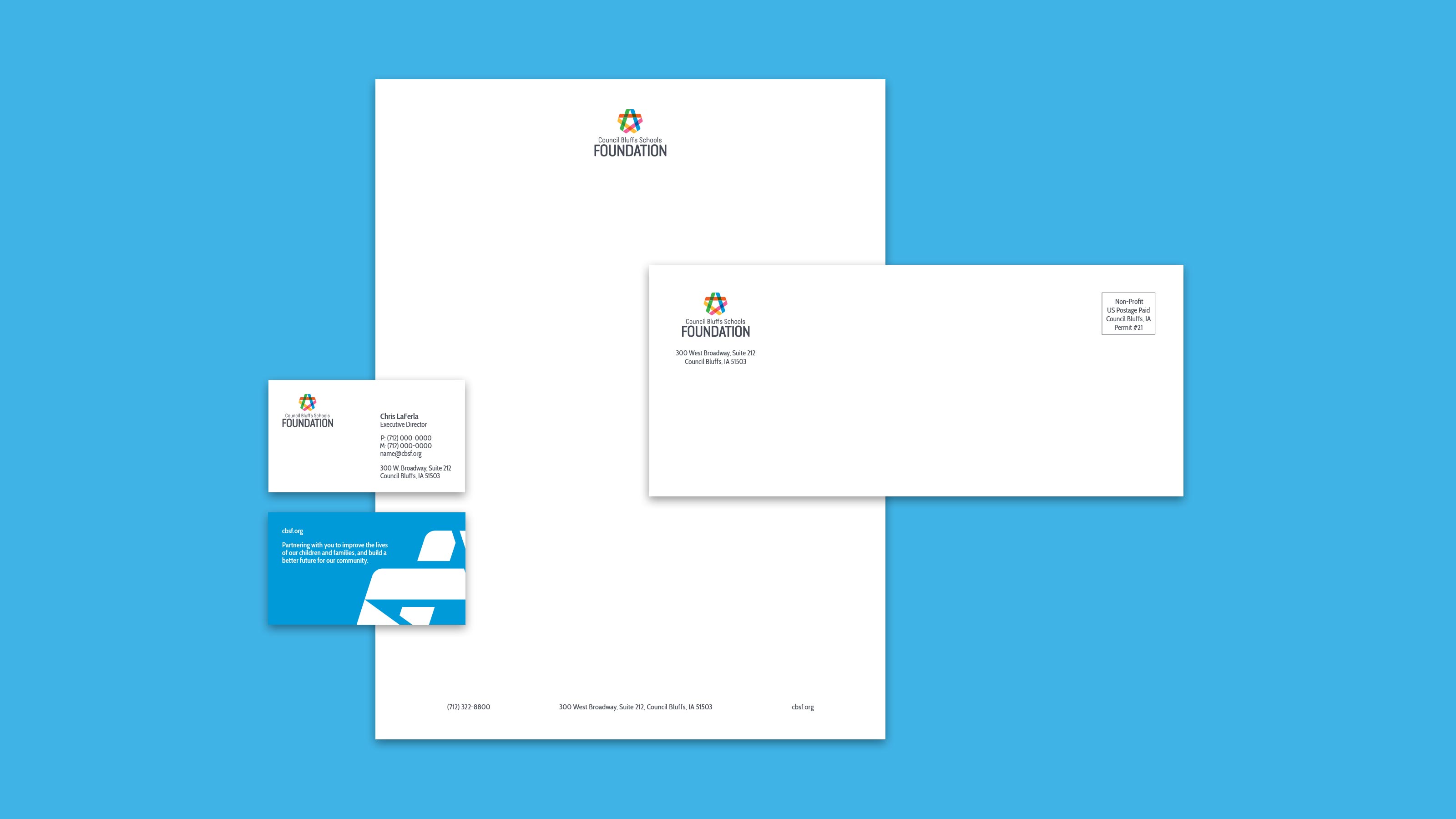


The rebrand resulted in a new overarching brand identity system, including letterhead and basic office materials, a logo variation for each program within the Foundation, typography, color palette, and photo treatments. In addition, the website was updated to reflect the newly focused mission and direction of the Foundation. Marketing materials such as presentation templates, brochures and other pieces were also created to help the Foundation expand its efforts.

